There’s a kind of summer that isn’t lived only outdoors. It unfolds inside, in interiors where—during warm, sunlit days—we seek refuge in spaces rich in comfort, beauty, and a quiet narrative undertone.
But how can we bring the dream of summer onto the creative surface of walls, within elegant and evocative spaces?
We asked our experts, who identified three key elements (plus one extra). First, the expressive potential of textured decorative wall finishes, designed to stimulate creativity. Then, the poetic selection of colour, chosen to evoke summer moods—fresh and relaxed. Finally, the pivotal role of light, which in the warm season shifts hour by hour, gaze by gaze, transforming the wall into an emotional journey full of surprises.
The secret ingredient? A touch of experimentation, carefully studied combinations, and a spark of creative flair.

Fresh, Saturated Colours. Leonardo Pelagatti’s Picks
Leonardo Pelagatti, Head of the Colour Design Centre, coordinator of the colourimetry team and member of the Centre of Excellence for tintometric systems at the Cromology Italia group – which includes Viero Decoratives – shares his reflections on summer colours:
“Summer means light, strong hues, warm colours, and the constant presence of heat.
In summer, we crave lightness. We want to slow down, enjoy open spaces. The image that comes to my mind is one of quiet countryside moments, green pergolas, time spent with loved ones.”
“If outdoor colours are bright and intense, indoor wall shades need to soften. They shift into more desaturated, powdery tones—because the surrounding natural light is already vibrant. That winter craving for brightness weakens in summer, making way for cooler shades.”
“Sand, linen, beige, desert tones and chromatic whites work beautifully—colours that feel round, warm, and embracing.
Tones that recall the sea, water, waterfalls, and the sky are also ideal.
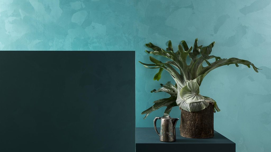
Blue tones are very popular. Often thought of as cold, blues are actually fresh. Coastal homes always feature blue—never icy, but instead bringing a pleasant coolness.”
“Sun-coloured shades are perfect indoors too, as long as they’re toned down. Honey yellows, ochres, desaturated oranges like apricot…
The key is to avoid overly aggressive tones. The goal is to recreate the relaxed and comfortable mood of filtered outdoor sunlight.”
“Greens are also essential, evoking countryside calm or mountain pastures. Sage green—very on trend—is a definite yes, along with dusty, muted green tones in general.”
“Another fascinating option is decorative glazing that captures the sun’s bleaching effect—its way of fading and softening colours, creating tonal variations.
Silicate products are also excellent, thanks to their shifting, light-reactive appearance, ideal for carrying that summery mood throughout your living space.”

Textured Finishes Inspired by Nature. Advice from Fabrizio Da Prato
We then turned to Fabrizio Da Prato, artist and master decorator at Viero Decoratives, to explore which textured effects can bring a breath of summer into interior spaces.
“One of the first finishes that comes to mind is Bianco Marina from the Petra Apuana line in our Made in Tuscany collection,” he tells us.
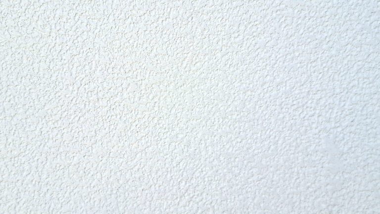
“But also Nativo and Tarsia from the same line. Both are light-toned finishes made with a high percentage of marble powder—perfect for evoking a fresh feel, even to the touch.”
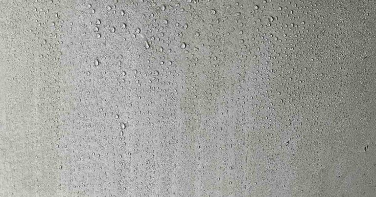
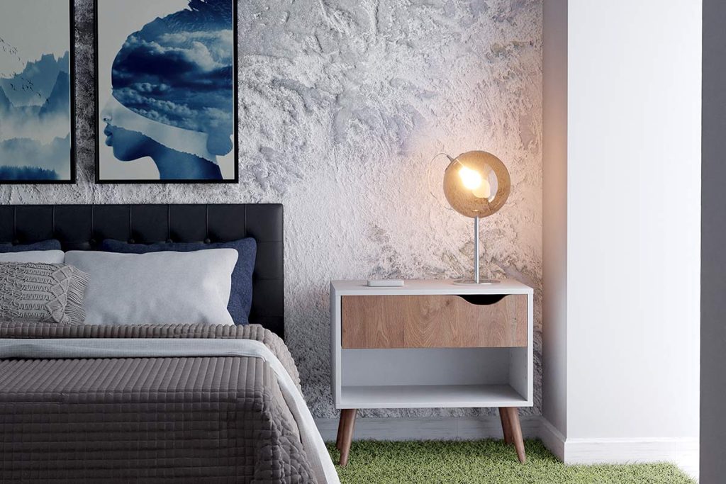
“For deeper tones, like grey-greens, this sense of coolness can also be found in refined finishes like Bardiglio, again from Petra Apuana, or Stone—created using VieroPlast to simulate the bocciardato effect, a traditional marble treatment that gives the surface a rough, natural, and rustic texture. It feels like having stone on your wall—gentle and aesthetically fresh.”
“From the Terre Etrusche collection, Vatluna is worth highlighting when paired correctly. Its cool silver tones and dynamic surface allow for beautiful light effects.”
“Lastly, Rete—especially in lavender, green, or light blue—creates a soothing effect. It brings to mind wind-blown grasses, breezy curtains, and the soft breath of summer in the countryside. The result is an ethereal, almost meditative atmosphere.”
The Master Decorator’s Extra Idea: Stone and Moon Craters in Total White
We challenged Fabrizio Da Prato for a bold, unexpected summer idea—and he delivered.
“Why not reinterpret the Moon Craters effect using the same traditional technique, but without added colour?
Using white VXF base and untinted Vixalit 500 makes the applicator’s job easier—especially in summer heat—but also results in a natural yet striking look.
The finish remains breathable, with a fascinating tactile contrast between the smooth polished surface and the rough craters. The final effect is reminiscent of a salt flat seen from above—very evocative.”
“The same concept works beautifully with Stone in its total white version: minimal, refreshing, and full of character.”
Step into the World of Viero Decoratives. Discover Every Effect!
At Viero Decoratives, our research focuses on expressive colour palettes and evocative textures—crafted to create multisensory products that stir emotion and define atmosphere.
If the insights from Leonardo Pelagatti and Fabrizio Da Prato sparked your curiosity, explore more on our blog.
To learn more about our products and step into the world of Viero Decoratives, sign up for our newsletter or get in touch with our team!