When you are designing a work space, choosing the colours is much more than a question of aesthetics: it is a functional, emotional and strategic decision. All professional jobs require environments that are capable of supporting the type of energy and concentration needed. But there’s more. In addition to colours, the textures of the surfaces also play a fundamental role, helping to make the spaces stimulating and welcoming while reinforcing the identity of the venue.
To make the right choice, you also need to consider the fact that every job triggers different stimuli. For example, some people need focus and order while others need creativity and energy, and others still, calm and reassurance. Colour can support these needs becoming a powerful ally in mental and physical welfare.
Let’s take a look at which solutions could be the most suitable based on the needs.

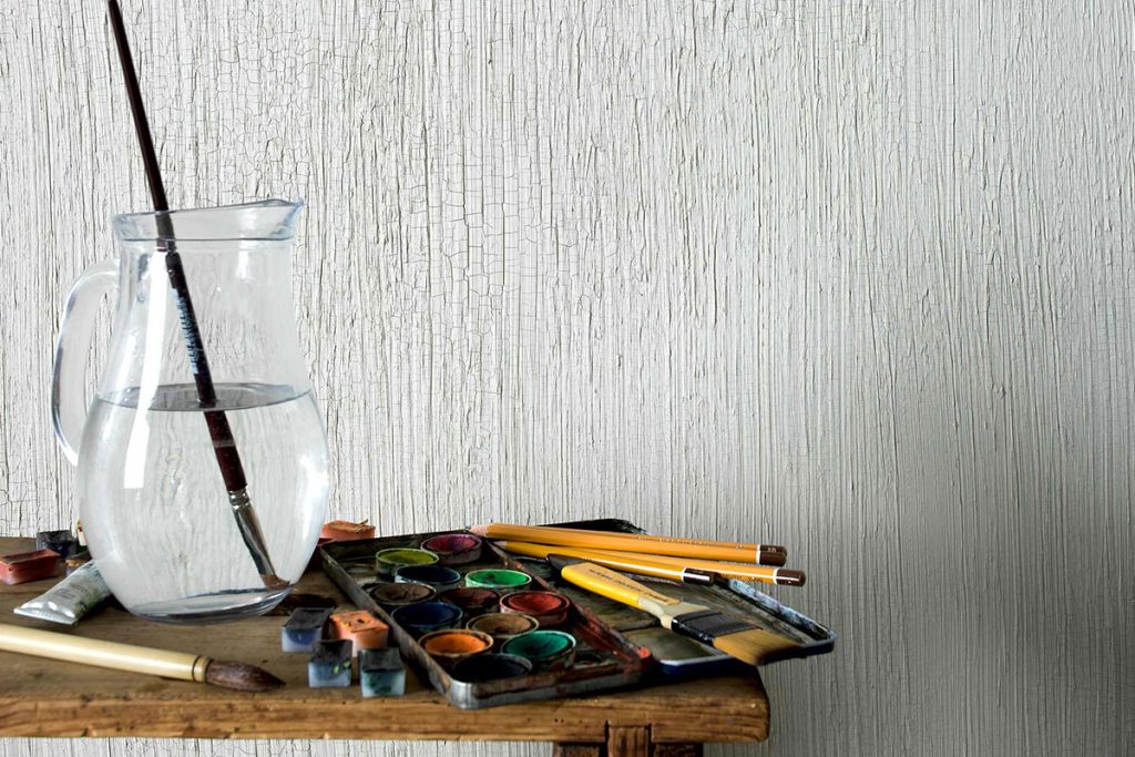
Energetic colours and dynamic textures for work spaces with a high level of creativity
In a creative setting, like a design studio or an advertising agency, dynamic shades are ideal, such as:
- Mustard yellow, to stimulate optimism and quick thinking;
- Desaturated coral, to transmit energy without going over the top;
- Sage green, to encourage a creative balance.
- These shades combine perfectly with bold, striking finishes. Take a look at the following products by Viero Decoratives:
- Allure, with silica sand and golden or silver reflections, ideal for creating sophisticated and bright effects;
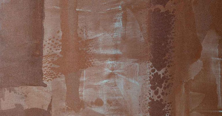
- Rusten Finish, if you want to go bold with a rusty metal effect and an industrial, contemporary look;
- E-Brezza, perfect for more structured and customised textured effects, in a classic or modern key.
Neutral, relaxing colours for more formal, official work environments
In settings that call for more formality and understatement, like law firms, administrative offices or banks – opt for more neutral, relaxing colours:
- Powder blue, that instils a sense of calm and authority;
- Pearl grey, to transmit order and balance;
- Neutral beige, for a discrete welcome.
- Here, surfaces with a discreet elegance are highlighted:
- Ghibli, with its matt sand-blasted effect to discretely add a sense of movement to walls;
- Viero Vel, to create soft, matt glazes on synthetic or mineral surfaces, perfect for understated but distinctive settings;
- Marmorin, a natural lime-based ‘marmorino’ effect, ideal if you are looking for a more ‘architectural’ finish, with timeless appeal.
To each their own. Colour and texture shape the functions of the spaces
In addition to the type of work, it is important to consider the function of the spaces within the work environment. Meeting rooms, operational offices and hospitality areas require different colour and decorative approaches, consistent with the type of interaction that you want to promote.
Moderation and dialogue. The watchwords for the meeting room
In areas dedicated to dialogue like meeting rooms, it is important to find a balance between leadership and comfort. In this case, colours such as warm grey, deep blue, dove grey or sandy shades are ideal because they boost concentration and measured exchanges.
The must-have recommended finishes must, however, include:
- Silk, for a soft, chiaroscuro metallic effect in shades of white, gold, silver or pink. An elegant, understated solution.
- Lithos, the contemporary reinterpretation of the Venetian plaster effect, perfect for conveying prestige and sophistication to presentation areas.
- Krakkle, if you want to introduce a subtle decorative play with a customisable crackle effect, for just the right amount of wow factor.
Provide a welcome with colours and textures. Spotlight on customer reception areas
Reception areas are the company’s business card. So, it is important to transmit personality, professionalism and hospitality there. Warm, sophisticated colours such as bronze, olive green, pale brick red or petrol blue are perfect for conveying a sense of stability and style.
For wall textures, take a look at:
- Allure, with its gold or silver iridescent highlights. It communicates luxury and elegance.
- Travertine, with its limestone effect. For a natural texture and strong architectural undertones.
- E-Brezza, for consistent versatility. Capable of creating sensory, structured walls, with an instant wow effect.
Would you like to learn more about the colour palettes and unique wall effects by Viero Decoratives? Write to us!
If all these tips seem useful and you’d like to find out more about the Viero Decoratives collection, write to us. We’ll be able to advise you on the most suitable solution for your project.