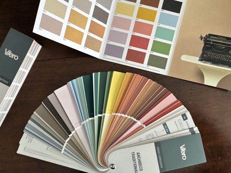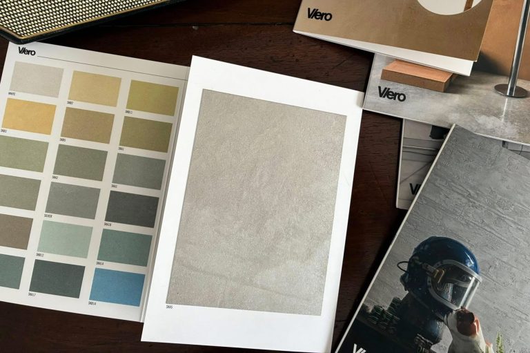
In contemporary surface design, inspiration is neither a spontaneous act nor a purely aesthetic reference. It is a structured process that begins with a careful reading of the space and evolves through a design synthesis capable of transforming an intuition into material expression.
The same applies to color selection in decorative finishes. Every chromatic choice, when coherent, is never simply a matter of preference, but rather a response to a specific design need.
Color becomes a design tool capable of altering spatial perception, interacting with light, enhancing materiality, and defining the identity of an environment.
In this article, our Color Expert Leonardo Pelagatti guides architects, designers, and decorators through the process that transforms inspiration into a conscious selection of surfaces, finishes, and colors.
Reading the Space: Light, Material, and Function as a Guide to Color Selection
The selection of a color or decorative finish cannot be separated from the environment in which it will be applied. Before imagining effects or palettes, it is essential to understand the context. Light is the first element to observe: its direction, temperature, and variability throughout the day significantly influence the perception of surfaces. A color never exists in isolation, but only in relation to the light that passes through or reflects from it.
Alongside light, the existing chromatic elements of the space also come into play: flooring, furnishings, and architectural details. The goal is not simply decorative harmony, but the construction of continuity—or, when necessary, a controlled contrast.
Materiality also plays a central role. Smooth or textured, matte or reflective, absorbent or vibrant surfaces: every decorative finish enters this system and shifts its perceptual balance.
Finally, the function of the space guides the design choices. A residential interior requires a different response compared to a retail or hospitality environment. Duration of stay, patterns of use, and the desired level of visual stimulation all change accordingly.
Analyzing the environment means defining a field of coherence. Everything that follows must respond to this initial reading.
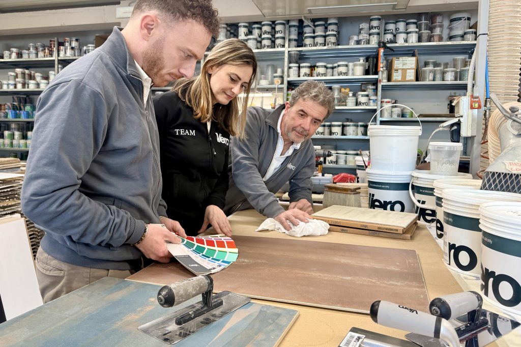
From Intuition to Design Direction: Defining the Intensity of the Surface
Once the context has been defined, the project enters a less linear but equally necessary phase: intuition.
This is where the choice of one decorative product over another takes shape—not according to trends or availability, but based on what the space truly requires.
Design intuition emerges from the meeting point between intention and perception. It may translate into the need to give a surface more depth, soften light reflection, or introduce a material vibration capable of activating the space without overpowering it.
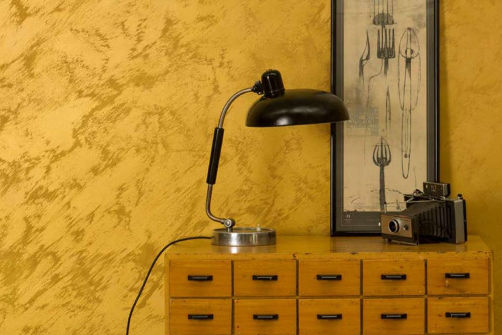
In some cases, the space calls for a stronger visual presence. Surfaces with more expressive effects, such as Allure or Erametal, introduce a clearly defined character: metallic reflections, dynamic color variations, and visual depth that shifts depending on the viewing angle. These are choices that shape the space decisively and become part of the project’s identity.
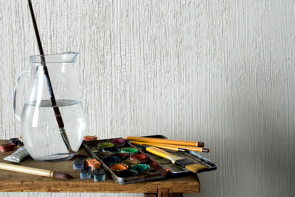
In other cases, intuition leads toward more subtle effects, where the surface works through restraint. Products such as Krakkle, Ghibli, or E-Brezza create a quieter presence: micro-movements, delicate textures, and almost imperceptible variations that accompany the space without imposing themselves. Here, color acts as a foundational structure, stabilizing the environment.
The objective is not to choose a more or less visible effect, but to identify the right level of intensity.
Inspiration as a Process of Translation and Dialogue
Design intuition does not emerge in isolation. It is nourished by references that often come from fields beyond decorative finishes.
Contemporary architecture, for example, suggests the use of continuous and monolithic surfaces. Product design introduces controlled textures and advanced finishes. Fashion and textiles explore layering and chromatic depth. Automotive and yacht design offer examples of high-definition surfaces, where light and color create sophisticated effects.
These references are collected and organized into broader design systems, such as curated collections.
Viero Decoratives’ Made in Tuscany Collection, for instance, is not simply a color proposal, but a design device: a system of atmospheres, materials, and colors that translates a territorial aesthetic into applicable design solutions.
Collections therefore become operational tools. They provide direction, support coherence, and help guide decision-making without reducing it to an isolated choice.
Building the Surface: Color as Design Material
When the process is coherent, color emerges as a consequence rather than a starting point.
A shade is never selected in isolation; instead, an entire system is constructed. Chromatic variations, layering, and material depth all contribute to defining the final perception of the surface.
Decorative effects are also carefully calibrated: they may be bold and transformative, or subtle and nearly invisible, but always in relation to the space. The scale of intervention is an integral part of the design.
At this stage, the relationship with light becomes central once again. The same finish may appear differently throughout the day, altering the character of the environment.
Designing with color also means anticipating these transformations.
Towards a More Conscious Approach to Decorative Finishes
Research in decorative surfaces is gradually moving away from purely aesthetic logic toward a more integrated design approach.
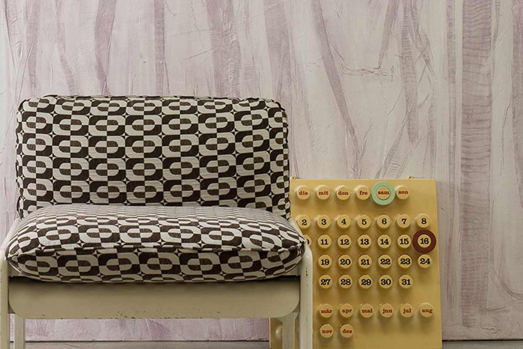
More expressive effects are used strategically, as focal points or identity-defining elements. More understated surfaces, on the other hand, build continuity and longevity.
Collections continue to evolve as design tools capable of connecting materials, colors, and contexts.
In this scenario, finding inspiration means identifying the right level of surface presence even before choosing the color itself.
Color and Material as Design Responses
Ultimately, choosing color for a decorative product is not an intuitive gesture in the conventional sense of the term: it is a balance between analysis and vision.
On one side lies the rigorous understanding of space. On the other, the ability to identify the necessary degree of material and chromatic intensity.
This is where inspiration is born: when color and material stop being options and become design responses.
Discover Viero Decoratives Color Collections
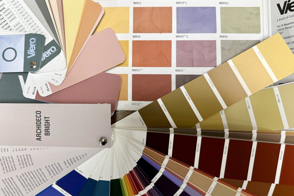
Viero Decoratives offers a color collection designed to support architects, interior designers, and decorators in creating conscious surfaces, where color, material, and light become true design tools. Be inspired by the Color Collection and discover the nuance that can give identity to your spaces.