More and more in recent years, attention to environmental issues, concerns all possible aspects of life, and consequently also design and living.
Sustainable living is important and can be done in many different ways; we are seeing an increasingly eco-friendly approach both in the field of architecture and more generally in design, and indeed we could say that the real added value of design creativity today is actually sustainability.
In this context, we increasingly read or hear about ‘upcycling’ and the creative reuse of vintage objects.
Upcycling: a definition created about thirty years ago that does not simply refer to the “recycling” of materials and objects, but indicates a particular design approach in which old products, objects or furnishings generally are given a greater and additional value when reused. Often these products are not reused as they are, but rather modified, their purpose or context of use are changed, their shape or colour also changed, so that they “leave” their previous origin and enter our daily lives in a new and original way, often becoming true design objects.
In addition to upcycling, the reuse of “vintage” furniture and accessories, giving them a second life, is particularly trendy today. Using furniture and objects purchased in shops or flea markets, or why not, found in the loft, offers many advantages; less waste, new inspiration for creativity, the possibility for everyone to be more sustainable, even with limited budgets, and above all the possibility of giving new life to family items that have a story to tell; ours.
How to create the right style context to enhance these objects? How to be at the same time consistent with their time of origin and update them with the most trendy choices?
Colour is the right tool to enhance the shapes and charm of these objects from past eras and bring them into contemporary contexts.
With Viero Decoratives, today we are going to give you some hints and ideas on how to enhance those particular vintage style settings that feature modern furniture and objects, especially from the 50s to the 70s (the so-called “mid-century modern”), or industrial vintage pieces from the early twenty century (the “vintage industrial” style), or “folk” furniture and objects made of rattan, bamboo and other woven fibres characteristic of the very current “Boho-Chic” style.
Let’s take a look at some specific examples.
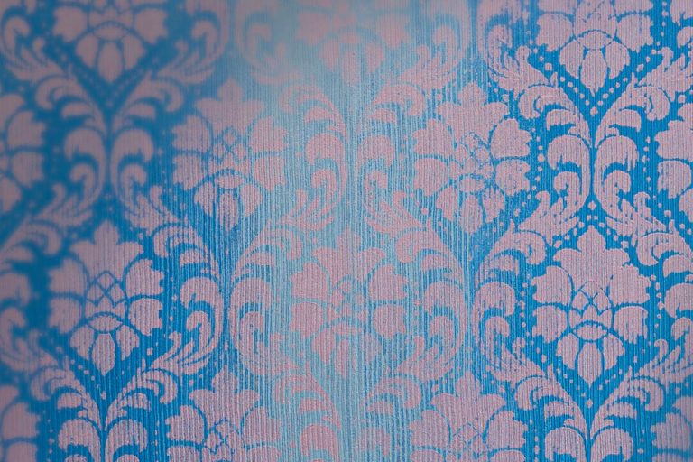
The vintage ’50s and ’60s saw the dominance of wood in intense orange-reddish colours; the warm colours of walnut, mahogany or teak are decisive elements in a room and therefore need to be combined with fabrics and walls in pastel colours, pleasant but delicate at the same time; to comply with the historical context, we can choose the softness of the MARMORIN FINISH, by painting one or two walls in shades of mustard (col. MM25), or olive green (MM04), or salmon (MM23), or aquamarine green (MM03), but how can we update them? By using neutral tones of grey on the other walls to soften the general effect, using for example the CHIAROSCURI effect made with ERAMETAL in the shade ERA01, that’s it; a contemporary approach to update the vintage!
If you love the “Folk” culture of the 70s, which is very trendy today, and you are fascinated by the “Boho Chic” style, you will have to choose the right colours for the typical natural woven materials, such as bamboo and wicker, and raw, natural fabrics such as linen and hemp, with light and relaxing shades.
The reference to naturalness in this case is very strong, so the main colours with which to enhance this style will be warm neutrals such as “dirty whites” and beiges.
A very versatile type of finish in a range of colours particularly suited to vintage styles is the GHIBLI finish,
Among the many nuances available, the neutrals GH64, GH68, GH70 are perfect, excellent if combined with green, whether light (GH53) or darker and deeper (GH126), or even more greyish (GH127 or GH54); these colours will be a winning choice as they are also an excellent background for the existence of green plants that this type of furnishing style loves so much.
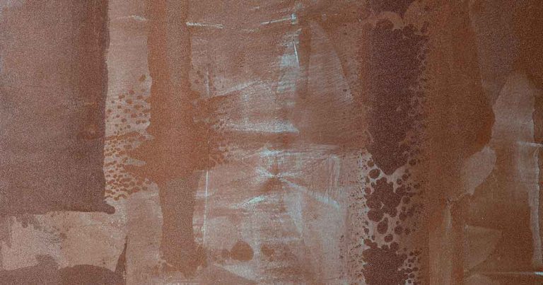
To conclude our brief overview, let’s learn how to combine the industrial vintage style, which likes contrasts between the white of ceramics, the black of iron and the burnt brown of leather, rust and aged wood; in this context, the material and iridescent effects of ALLURE,
which also offer many neutral and pastel shades, or the decorative finishes of TERRE ETRUSCHE such as the fantastic VELATHRI, made with E-BREZZA and ERAMETAL, will be ideally suited.
Now it’s your turn! Try now to find the right background for your vintage items !