In hospitality design, colour cannot be treated as a uniform element.
Unlike residential spaces, where continuity and reduction can often guide the project, a hotel is an articulated system. Different environments coexist within the same structure, each with its own function, duration of use and level of attention.
“In this context – explains our Colour Expert, Leonardo Pelagatti – the objective is not simply to choose a coherent palette. It is to build a perceptual sequence.
Colour, together with material and finish, becomes a tool to modulate the transition between spaces, regulate the energy of each environment and guide the experience.
Decorative surfaces, as systems in which colour, material and finish coincide, make it possible to work on this articulation with precision. They do not simply introduce a finish; they define the behaviour of the space”.
Colour in Hospitality Spaces. From Palette to System
A recurring mistake in hospitality design is to apply a colour palette in a homogeneous way.
This approach simplifies management, but tends to flatten the experience. An effective system, instead, works through controlled variations. It does not break overall coherence, but introduces readable differences. Each environment maintains its own identity while remaining part of a whole.
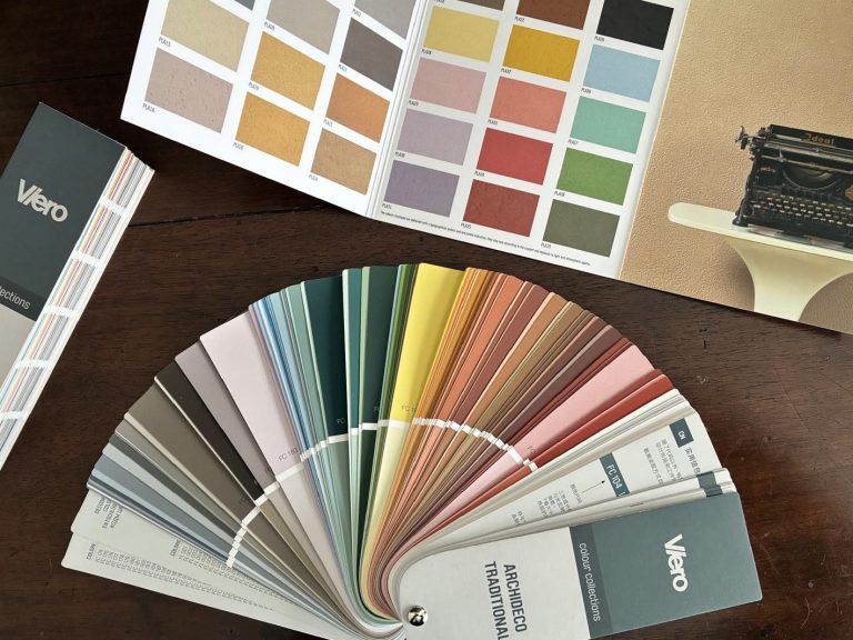
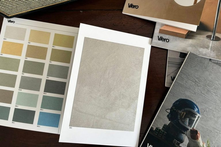
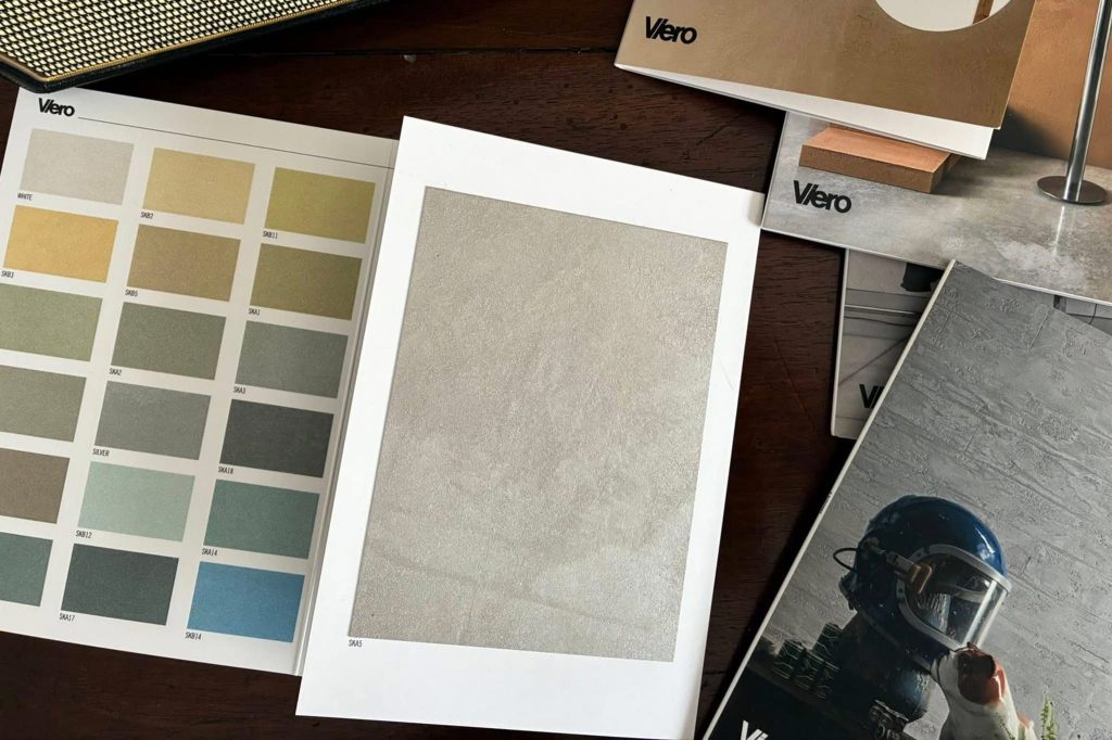
In this transition, the colour charts associated with each product take on a precise operational role. Each decorative finish does not offer a single shade, but a specific colour range, already calibrated according to the material and the finish itself. The designer does not select an abstract colour, but works within a chromatic field that is already coherent with the behaviour of the surface.
The palette is therefore not independent from the product: it is intrinsic to it. This makes it possible to build controlled variations while maintaining perceptual coherence.
Let us now look in detail at the different hospitality environments and how colour and decorative surfaces can be articulated within them.
Reception: Definition and Orientation
The reception area is the first point of contact. Here, colour must work through clarity and stability. Palettes move within warm, neutral tones: mineral beiges, sands, light greys with a slightly warm undertone, with very restrained accents. The choice is made within the colour ranges of finishes such as Travertine or Marmorin Extra, which offer tones that are coherent with a continuous and legible materiality. The objective is not to attract attention, but to make the space immediately understandable.
Lobby: Building Permanence
The lobby introduces a first level of articulation. The chromatic field expands: layered beiges, desaturated greens, warm medium greys, with deeper yet controlled accents.
At this stage, working within the product colour charts makes it possible to introduce variations without breaking continuity. Differences emerge through proximity, not through contrast. Ghibli and E-Brezza make it possible to create continuous backgrounds with light variations. Krakkle can be introduced in a targeted way, choosing compatible tones within its range. The lobby becomes an articulated yet coherent space.

Bar and Restaurant: Activation and Density
In dining and consumption areas, colour can take on a more active role. Palettes shift towards deeper, more evident tones: blues, greens, browns and desaturated rust shades.
Here, the relationship between colour and finish becomes more explicit. The colour charts of products such as Allure, Con-Tatto and VXF offer ranges designed to work with reflection, depth and texture. Perceptual density derives from the combination of tone and surface behaviour, not from pure saturation. The space intensifies, while remaining controlled.
Guest Rooms: Reduction and Continuity
The guest room requires the opposite logic. Colour is reduced to soft fields: beige, warm greys, muted greens, almost imperceptible powder tones. Here, it is essential to work within narrow and coherent colour ranges. The colour charts of E-Brezza, Ghibli and Marmorin Hydro make it possible to build minimal variations without introducing discontinuity. The surfaces operate below the threshold of perception. Colour does not define the space; it stabilises it.

Bathroom: Control and Precision
In the bathroom, the relationship between light, water and materials is more critical. Palettes move through stone tones, greys and controlled beiges. The chromatic choice must be closely linked to the finish. The ranges of Marmorin Hydro and Travertine make it possible to maintain coherence even in conditions of strong reflection. The finish regulates the perception of cleanliness and continuity.
Conference Room: Active Neutrality
The conference room requires concentration. Colour works through subtraction: medium greys, neutral beiges, powder tones.
The colour charts of Ghibli and E-Brezza make it possible to avoid flat surfaces, introducing micro-variations that maintain depth without interfering. It is a constructed neutrality, not an absence.
Gym: Controlled Energy
The fitness area requires greater activation. Palettes include stronger yet mediated tones: structural greys, deep blues, intense greens and burnt oranges. The chromatic ranges of VXF and Con-Tatto make it possible to work on more physical surfaces, maintaining coherence between colour and material. The energy is controlled, not dispersive.
Spa: Reduction and Absorption
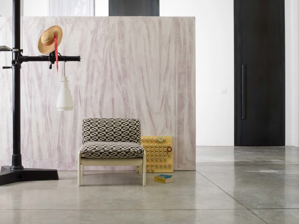
The spa represents the point of maximum reduction. Palettes contract: natural beiges, sands, warm greys and desaturated aqua greens. The colour charts of Marmorin Hydro and Oltre make it possible to build deep continuity, working through minimal variations. The surface absorbs light and reduces contrast. The space slows down.

A Continuous System
Ultimately, articulating colour in a hotel does not mean differentiating each environment arbitrarily. It means building a progression. From the clarity of the reception area to the density of public spaces, through to the reduction of private and relaxation areas. Variations are gradual. Decorative surfaces, as complete CMF systems, make it possible to construct this continuity. Their colour charts turn this process into an operational tool, offering coherent ranges already integrated with material and finish.
Surfaces and Colour in Hospitality Design
In conclusion, in hospitality design, colour is not an autonomous element. It is inseparable from the surface that generates it. For this reason, the choice does not concern only the shade, but the system that produces it: material, finish and available colour range. Decorative surfaces make this integration immediate. Colour charts are their tool. It is in this coincidence that colour ceases to be a selection and becomes design.
Discover the Colour Charts by Viero Decoratives
Viero Decoratives offers a wide range of solutions for decorating architectural surfaces, with each decorative finish available in multiple chromatic proposals. Discover all the colour charts and choose the most suitable tone for your hospitality project.