Mineral neutrals, colourful furnishings and tactile surfaces: insights from the Color Design Center.
By Leonardo Pelagatti, Color Expert and Coordinator of Cromology Italia’s Color Design Center
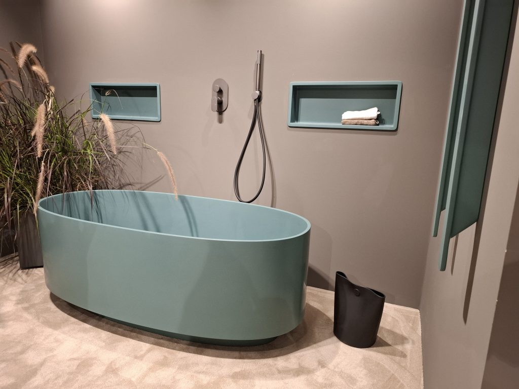
Visiting Cersaie is an opportunity to observe how interiors are evolving through the materials that shape them. Ceramics, bathroom furnishings, taps and finishes reflect choicesinvolving colour, light, tactility and the relationship between different surfaces.
The 2026 edition, which concluded in Bologna on 25 September, offered an opportunity to explore these developments and identify useful directions for interior design. For Cromology Italia’s Color Design Center, the visit forms part of its Color Intelligence activity: observing emerging design languages, comparing materials and combinations, and translating thesesignals into palettes, colour tools and practical guidance for professionals.
Light changes the way we perceive a surface
Stone, marble and concrete remain important references in the textures we observed. What makes these surfaces particularly interesting is the scale of the pattern, the distribution of variations and the way each finish interacts with light.
A surface may appear calm and understated from a distance, yet reveal a more complex texture when viewed up close. This dual perception is particularly relevant to decorative finishes: a large wall surface needs to maintain visual balance within the interior while still offering detail and interest at close range.
The exploration of reliefs, incised patterns and three-dimensional structures further strengthens the relationship between surface and lighting. For designers, this highlights the importance of assessing samples both frontally and from different angles, observing how texture and reflections change with the light. A photograph provides an initial reference; a physical sample allows for a more informed evaluation.
Sheen also plays a role in the colour scheme. Matt, satin and gloss finishes change the way a colour and surface are perceived, and can be combined to create subtle variations withinthe same colour family.
Formats: continuity and rhythm
Another direction we identified during the visit was the return of smaller formats, including elements in brighter colours. Alongside large-format surfaces, these smaller modules create opportunities for compositions based on repetition, laying direction and contrast.
Scale becomes a design choice in itself. A large, continuous surface can create a sense of visual continuity, while a smaller module can define an area or introduce rhythm. In decorative finishes, the equivalent consideration is the scale of the texture: how visible should the application technique be, and how should it relate to the dimensions of the wall?
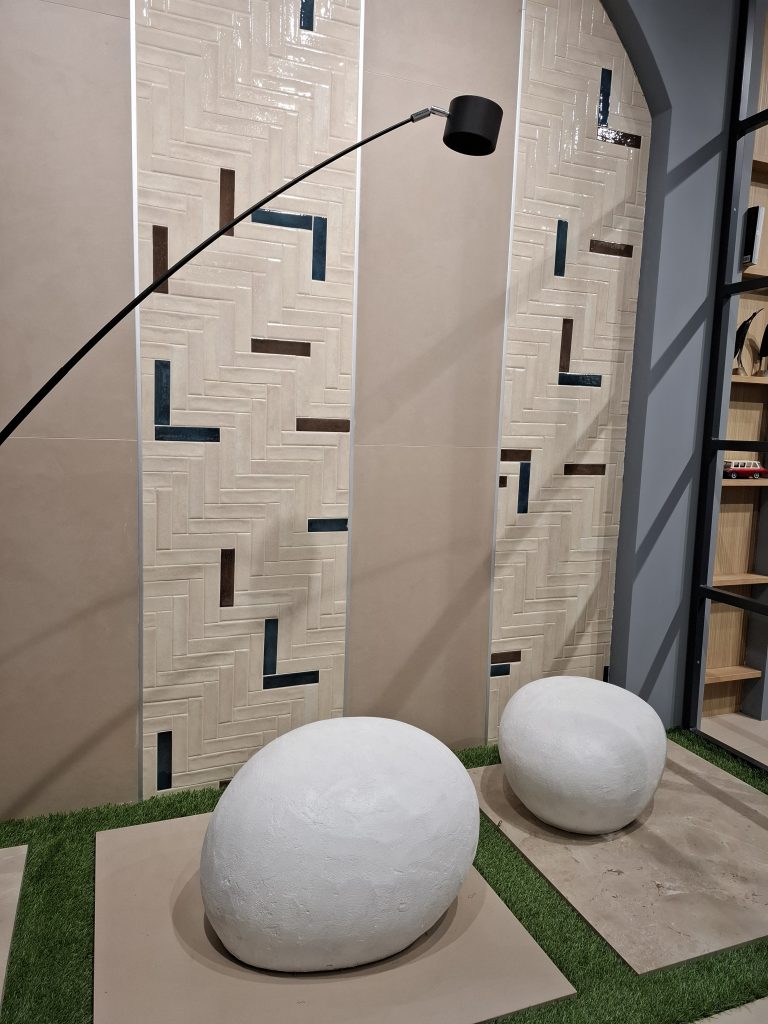
This relationship is clearly visible in the photograph combining broad beige surfaces with bands of small, glossy rectangular elements. Changes in laying direction and the introductionof darker inserts create rhythm within a restrained palette. Differences in reflectivity also distinguish the decorative bands from the background, even when the tones are closelyrelated.
This offers an interesting reference for decorative wall finishes: within the same interior, a matt wall surface can complement glossy ceramics, while colour creates continuity betweenthe two. The interest comes from the balance between scale, pattern and finish.
Directions for decorative finishes
The Color Design Center’s observations highlight several areas worth exploring further: mineral backgrounds with subtle variations, complex greens, matt and velvety surfaces, restrained relief effects, and coordinated combinations of walls, ceramics, furniture and metals.
For Viero Decoratives, these signals can become a starting point for material research and design exploration. A decorative finish can pick up an undertone from the flooring, complement a coloured piece of furniture or introduce a different response to light. The choice depends on the visual hierarchy intended for the space.
Where highly patterned ceramics are used, a wall with a subtle texture can give the composition room to breathe. When flooring and furnishings are more understated, the decorative finish can take on a stronger role through texture, depth of colour or reflectivity.