Spring 2022 brings a mix of soft, subtle tones and dominant colours with strong individuality into homes, expressing the diversity and countless possibilities of the modern lifestyle. Bright neutrals, muted mineral tones and soft pastels, as well as rich natural earth tones, ensure dynamism and vibrancy. Integrating neutral and delicate shades with stronger and more expressive tones, allows interior design to bring a breath of fresh air into the house, just like the feeling of a flowery bouquet in its many fragrances and nuances.
Viero Decoratives impressions are ideal for giving our homes the sparkling vibrancy of the first signs of spring.
.
The colours of spring in the trends of Viero Decoratives
As soon as the days get longer, leaving behind the memory of the cold and grey winter, it feels like waking up from a long hibernation. Even our homes and gardens look dusty and dreary after the winter months, in need of a simple and effective renovation.
Trendy colours for spring 2022
The walls are, together with the floor, the most visible and aesthetically striking part of a house. With the advent of spring, we begin to feel the need for renewal: just as nature awakens in its new cycle, so the desire for change and novelty in our houses becomes stronger in order to face the summer season in the best possible way; it is the right time to think about, how to give the place where we live, a breath of freshness and novelty.
The easiest and most effective way to change the face of your home is certainly to change the colour of the walls to give your home a new look and improve its energy and positive charge, thus benefiting the vitality and mood of its inhabitants. The colours you choose to paint your walls should make you feel good.
Colour experts recommend keeping a natural and relaxed inspiration for interiors. Keeping our home connected to nature, recalling its colours and through them its various emotional sensations and calming power, universally recognised, will allow us to create a balanced and relaxing environment to rest and recharge, without falling victim to the various stresses of everyday life.
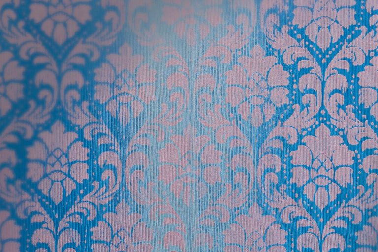
Spring is precisely the season in which nature’s colours manifest themselves in their many brightest, yet cool and delicate shades. In order to keep the hectic pace of modern life out of the house, so to say, green in a wide variety of shades and intensities is once again becoming one of the trendiest colours, rightfully regaining its privileged position in bringing nature into the house. Just as it does in nature, where it can be combined with the most varied colours and contexts, it is adequate in a house, to choose the right shade to make it a particularly versatile colour, the absolute protagonist of a room or a balanced support colour for other tone combinations.
If you choose a palette that includes pastel tones, it will make the colour harmonies light and calm, giving a feminine and delicate touch. For example, one of the spring colours par excellence, pink, can be used again this year in its more shaded nuances.
If, in order to give more energy to the interior, you may choose to accentuate and give a little more fullness to the shades of colour, combine them with fuller “earthy” and dry colours, such as cinnamon or tobacco. If, on the other hand, you want to emphasise freshness and lightness, sage greens and blues in all shades of, aquamarine will be the ideal choice.
Spring also represents the great return of light after the dark winter period, so all the colours in combination with a generous use of white or softer shades of white, such as cream and ivory, will be brighter, more positive and relaxing and will connect us better to our surroundings.
The skilful match of more delicate shades with more intense colour accents within the same colour palette will allow interesting details to be emphasised and focus attention without distracting from the sense of balance of the whole.
An eye for the latest colour trends
The Pantone colour of the year 2022, “Very Peri”, is a typical spring colour, the colour of primroses, the first flowers to open at the thaw. It is a colour that encompasses the suspended meditation of periwinkle and the desire to attract with the elegance of dark red. It is a colour that can inspire us to make our spring “trendy” at home too.
Excellent combinations with the periwinkle from which it derives and with burgundy, but also with earthy tones or mustard yellow or even aquamarine green and ultramarine blue.
Bringing spring into your home with Viero Decoratives’ made in Italy products
The shades made in Italy by Viero Decoratives are ideal for bringing the tones of spring into our homes.
Fossili made with Travertine and chips recreates a particular effect similar to the porosity of Travertine, contemporary and refined, but at the same time textured and primitive, given the small inclusions in the colours of your choice, making it unique and never trivial, even on a very large wall, for example an ideal background for wooden furniture, leather or very large works of art.
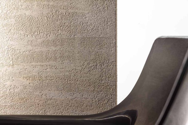
Among the effects tending towards neutral textures, Viero Decoratives Marmorino is a perfect, original and trendy solution for the walls of the home. Its material variations, described below in their particular characteristics, give richness and presence to the surfaces, allowing them to remain protagonists even in the presence of brighter colour accents, creating a balanced background tone perfect for the most varied situations.
In particular, Marmorino made with Marmorin Hydro gives walls a matt and compact effect, elegant and sophisticated, inspired by the preciousness of marble, also designed for surfaces exposed to humidity and water; Marmorino made with Marmorin Extra presents tiny craters and a slightly more textured look, giving smooth translucent surfaces and visible grains; Marmorino made with Marmorin Sand gives walls a refined look and creates harmonious and relaxing atmospheres.
Concrete B made with GHIBLI and Viero Vel is inspired by the look of fine concrete used in architecture, a very textured grey effect that is currently very trendy: the ideal backdrop to enhance the woods on the floor and both soft and bright colours of the furniture and accessories.
Stucco Veneziano made with Lithos gives a warm and natural taste of a spring house, evoking the softness and rarefied luminosity of the more traditional Venetian stucco.
Chiaroscuri made with Erametal evokes finely metallic shades giving great personality to a spring house, an excellent support solution for all seasons but very suitable to give depth and vibrancy to the green and blue shades of lawns and skies.