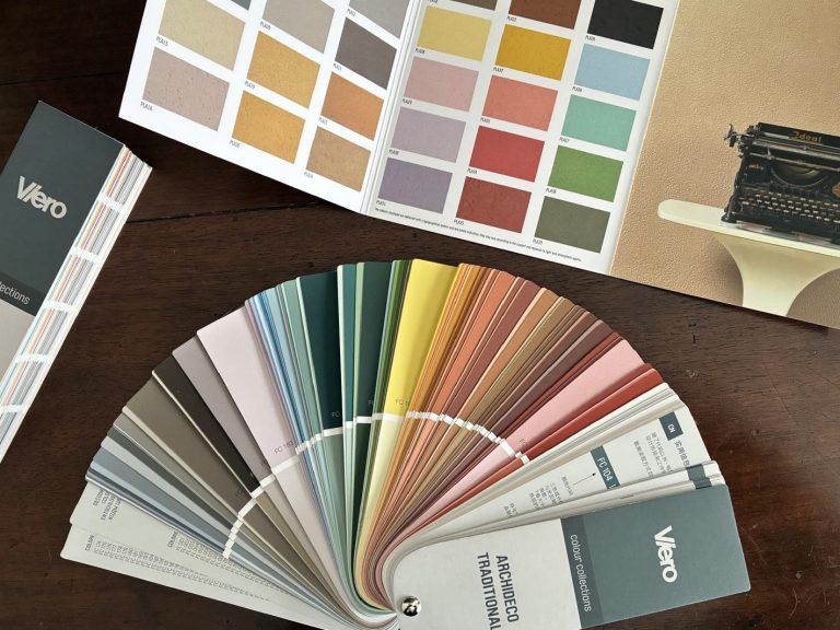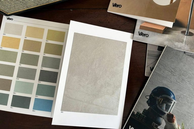
Designing colour in wet areas means working with a perceptually unstable material. Bathrooms, home spas, wellness environments and spaces dedicated to body care are contexts in which light is never neutral: steam diffuses it, condensation softens it, water reflects it and multiplies its glimmers. In these conditions, colour does not remain unchanged; it evolves in response to the environment. We hear from Leonardo Pelagatti, Color Expert at Cromology Italia and Head of the Color Design Center.
Wet Areas: How Decorative Finishes Change Colour Perception
Humidity systematically alters colour perception. The presence of micro-particles of water in the air lowers contrast, reduces perceived saturation and makes surfaces appear more matte. Shadows become less defined, while tonal transitions grow softer.
A colour applied in a dry area may appear full and consistent, while that very same colour, in a shower area or near sources of steam, may look more subdued, sometimes even slightly cooler. If not anticipated, this perceptual shift creates discontinuity between adjacent surfaces even when the same shade has been used.
Colour Design in Wet Areas: Why Anticipation Makes the Difference
In the world of decorative coatings, this calls for a shift in approach. The task is not simply to choose a shade, but to predict how it will behave in use. Colour must be calibrated by taking its inevitable softening into account: in some cases, it is advisable to work with slightly greater saturation than the desired final effect, or to reinforce value differences between surfaces so that steam does not flatten them out. In short, colour design in wet areas is always an act of anticipation.
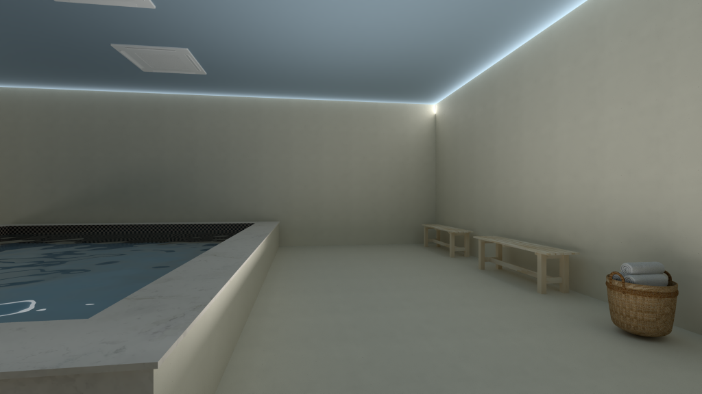
A color proposal for a pool area using the OLTRE decorative system
Walls and Surfaces in Wet Areas: The Cognitive Dimension of Colour Choice
Alongside the physical dimension, there is also a cognitive one that is just as decisive. Our brains implicitly associate certain colour registers with water, freshness and cleanliness. This is not a stylistic convention, but a deeply rooted perceptual response. In a wet space, we expect coherence with the liquid element: a mineral, natural, slightly cool or neutral matrix, capable of evoking the imagery of smoothed pebbles and river rocks shaped by clean running water. These are material archetypes even before they are chromatic ones: compact, softened surfaces, desaturated colours that move between stone greys, damp sands, muted greens and watery reflections. When these references are missing, the space can feel perceptually incoherent, generating a subtle sense of dissonance with the presence of water.
It is precisely at this intersection between the physics of light and cognitive expectation that surface quality becomes decisive. In the presence of humidity, perfectly smooth and uniform surfaces tend to flatten out. Reduced contrast makes colour feel fragile, almost two-dimensional. By contrast, a mineral finish with controlled micro-variations introduces a vibration that preserves depth even when light is diffused by steam. Matter acts as a perceptual stabiliser, restoring body to colour.

Designing Colour in Wet Areas with Marmorin Hydro and OLTRE
Marmorin Hydro by Viero Decoratives responds to this need through an approach fully aligned with the contemporary design of surfaces. Its mineral nature and subtle texture generate slight modulations that diffuse light without fragmenting the space. In humid environments, colour does not appear flat but layered; the micro-shadows created on the surface compensate for the natural desaturation caused by humidity, preserving legibility and tonal depth. The surface does not merely clad the space: it builds an interior mineral landscape, coherent with the imagery of water flowing over stone.
At the same time, the OLTRE system makes it possible to extend this coherence to the spatial scale. Continuity between walls and floors removes joints and visual interruptions, transforming the environment into a unified chromatic field. In a seamless space, colour becomes an inhabitable volume rather than a simple applied finish. Under humid conditions, this continuity heightens the sense of calm and stability, yet it also requires a high level of design precision: every tonal imbalance becomes immediately visible, every uncontrolled variation is perceived as a fracture. For this reason, choices should move towards evolved monochromes or palettes with very close values, relying on matter and light to create depth rather than on strong contrast.
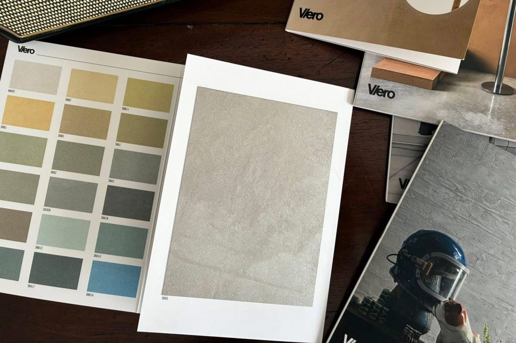
Some suggestions from the Viero Decoratives color collection
Colour Design in Wet Areas: Three Dimensions to Consider
Designing colour in wet areas therefore means integrating three inseparable dimensions within a single system.
• Anticipating the perceptual transformation induced by humidity.
• Activating cognitive expectations consistent with water, freshness and mineral naturalness.
• Using matter as a tool for chromatic stability and intensification.
What must be avoided is not only excessive saturation or the use of overly dark tones in small spaces, which humidity makes feel heavier, but also the use of optical whites or neutral shades lacking undertone, which under steam take on a cold and undifferentiated character. What should also be avoided, above all, is a fragmented, surface-by-surface design approach: in wet areas, the result depends on the relationship between dry and wet zones, between direct and diffused light, between walls and floors.
In these contexts, colour is not an isolated element but a continuous system, in which water, light and matter work together to define the overall perceptual experience.

Bathroom, private residence rooms I Prague, Czech Republic | made with Marmorin Hydro
Give Character to Architectural Surfaces. Discover the World of Viero Decorative
From chromatic research to matter, from textures to performance, Viero Decoratives offers a universe of solutions designed to enrich the project and support the creativity of architects, interior designers and space makers. Read the other blog articles featuring advice from our experts and explore the website to discover all the design possibilities offered by Viero Decoratives decorative finishes.