We are rediscovering a neutral and elegant colour that allows us to warm up the dark tones in our homes.
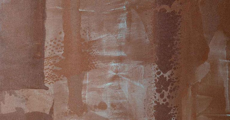
Having been absent from the design scene for several years, we are witnessing the great return of brown and all its shades to the darker hues scene. After years of black’s dominance and the occasional appearance of blue, which is still holding the stage, this softer, warmer colour than the two previous, has burst onto the scene. It is the perfect complement to the desire to design soft, enveloping interiors in harmony with all the shades of wood, the most widely used material in interior design, as we find it, both in floors and in furnishings and accessories. So let’s make wood “resonate” with its chromatic counterpart, brown.
This colour represents an interesting feature in many colour palettes, working perfectly as an accompanying neutral. Interpreting it as “the new black” means that black needed to soften and warm up, softened by shades of brown, ranging from ebony, chocolate, cappuccino to tobacco.
Full, dark brown has been expected for a few years now, heralded by the lighter, more intense shades of beige and burnt tones, great classics of the 1970s. Now it has returned in a big way and, even more remarkable, in summer colour palettes and not only, as one might think in the autumn ones, which at first glance seem to be more suitable.
Basically we have inclusive colour palettes of brown, for every season of the year, let’s see how.
In Spring, browns light up with the green tones of buds, the soft pinks or brighter blossoms and the intense blues and indigo of irises and hydrangeas. To reproduce these palettes, choose from the Viero Decoratives range of colours the finish ERAMETAL: for browns in the “ERA11” more “lunar” and rosy shades, or ERO11″, more golden and intense and for the colours of the flowers, light it up with the finish ALLURE: in the colours of the palette “ALA17”, a beautiful wisteria, or “ALA50” the petals of the hydrangea, both excellent with “ALA25”, the sharp and bright green of the buds.
From spring to summer, brown becomes dry and bold under the warm rays of the sun and will go very well with the colours of the sea such as the turquoises and blues of ALLURE: in the colours “ALA26” or “ALA28”, but also arrangements made entirely of neutral and elegant shades such as rope and absolute white, giving them definition and a decisive imprint of style, making them also suitable for work or purely masculine contexts. As brown also reflects the calcareous hues of beached woods and the pinkish hues of iridescent seashells, think of the many decorative possibilities of materials such as mother-of-pearl, used as a detail or to cover furnishings, which will match brown perfectly. Small pieces of furniture and glass details will also complete the colour scheme, as transparent glass acquires that aquamarine hue that reminds us of a day at the beach in front of a crystal clear sea and gives lightness and freshness to browns, which are in themselves dry and dull colours. GHIBLI :with the light sand colour “GH58” or the medium sand colour “GH70” but also all similar colours such as “GH73”.
Autumn arrives every year, heralded by the many shades of leaves that change colours, and browns will easily match the thousands of colours of “foliage” ranging from leather to burnt, oranges, full yellows and reds of American vines, to the almost purple plums of figs and ripe grapes.
Viero Decoratives offers these shades, for example, with MARMORIN EXTRA: each neutral colour goes well with brighter colours, as in MM04, MM25, MM39, MM 40, to be used on a single wall as an accent, but also to be dared on all the walls if for example it is an entrance or a access room.
The winter time, with it white sheet of frost and snow, associated with this season by the folk memory imagination, the neutral palette will cover it with elegance, making it suitable for any situation, not only with absolute white, but also with the so-called “fake whites”, i.e. those various shades of cold and warm greys, to come with any neutral palette which will match perfectly with unexpected touches of colour. In order to give movement and texture to neutral colour palettes, choosing a finish, a more animated and textured “effect”, will be the right choice. Here are some possibilities for this palette with Viero Decoratives KRAKKLE products: for example, by combining colours KK08 and KK09, or if you like more amber and warm nuances, colours KK15 and KK13.
Finally, a style tip: like black and grey, brown especially in medium-dark tones, has the ability to give “seriousness” to the range of pinks, separating them from the more purely feminine and childish contexts to which they are usually confined, but opening up for pinks gives the possibility to become the leitmotif of an entire project and not just of the “little girls’ room”.
Here then, in combination with brown, a pink for all seasons, selected for you by Viero Decoratives: LITHOS/MITHOS LUX – VP38.