When we are in the renovation phase of our home, let’s follow Viero Decoratives’ useful advice to find the perfect match between the colour of the floor and the colour of the walls we intend to renew. Here are the basic general rules indicating which colours and finishes are most suitable to make the best of each type of material we are likely to have on the floor.
Currently, the most popular types of flooring are: parquet, in various formats, essences and finishes, tile floors in more traditional and smaller formats, such as terracotta finish or traditional majolica and cement tiles, or porcelain stoneware in larger formats, and also stone floors (including marble), especially in country homes, or country cottages or elegant historic buildings, and resin and cement floors with an industrial and minimalist look typical of the most contemporary and innovative architecture. Each of these types of material is specifically enhanced with certain colour combinations and decorative effects.
IF THE FLOORS ARE MADE OF WOOD (or of different materials that imitate wood finishes in their appearance)
If we have wood on the floor, or materials such as laminate or porcelain stoneware that imitate the “wood” effect, the look of the room will be warm, important and luxurious: in fact, wood is considered a valuable construction material and is both simple and elegant. Much of the final decorative effect will depend on the size of the lath and the colour combinations we choose. Larger formats of lath or floor planks, and fashionable layering such in a herringbone pattern, are suitable for elegant furnishings and classic or minimalist and contemporary styles, and consequently it is optimal to combine them with trendy colours such as aquamarine green, peacock blue, powder pink or teal, and precious finishes such as Venetian stucco to enhance the wood’s ability to be modern and contemporary. Smaller, more versatile formats will suit relaxed styles such as country and its light pastel colours, or the ‘Industrial’ style with its anthracite greys and tobacco and dove-colour tones. The Colour-Collections of GHIBLI and LITHOS will enable you to find the most suitable colours.
Colour combinations with wood, since it is the most versatile material for floors, are practically infinite as wood complements everything, and this is generally applicable. In particular, however, it is worth remembering that parquet can have many different finishes that prefer different pairings.
Light-coloured woods in natural or bleached finishes such as oak, birch, pine, spruce and similar combine well with all colours, because they are in harmony with pastel colours, contrast nicely with darker shades and are vitalised if we use, full cheerful colours; in short, they are “passe-partout” that will never be out of fashion. All decorative effects are permitted with light woods, making them truly one of the most versatile and timeless choices for a floor.
Medium-dark timbers such as walnut, dark oak, ebony or wengé effects (and similar) are very elegant, but in order not to darken the rooms too much, they are best combined with light-coloured walls: both light colours and light neutrals. On walls of rooms with dark floors, it will be advisable to choose effects and finishes that are also metallic or pearlescent, such as the ALLURE or ERAMETAL finish, which will contribute with their particular refined way of capturing the light to make the room more pleasant and bright.
Parquet floors with “grey” or cold-coloured finishes, which have been much in vogue in recent years, are preferred to be combined with walls in colours which warm things up a little; sand rather than iron tones, greens rather than blues.
Reddish and orange-coloured woods with a “vintage” and “1950s” look such as mahogany, cherry, merbau or doussié (and similar) have a very important and intense colour, which makes combinations with other types of wood in furniture for example, more challenging. We try in this situation to “freshen” them up a bit with cool or cold colour tones of the green and blue family, and if we want to freshen them up even more to make them look modern, they will look great paired with the cold grey of the walls, either in light dusty grey tones or in darker anthracite or iron tones. The best finishes and effects will be textural and opaque or only slightly translucent like the effects of MARMORIN EXTRA AND MARMORIN SAND, with their interesting and extensive colour-Collection
IF FLOORS ARE TILED
Tiles influence the colour scheme in particular in certain features: they may themselves be coloured or may even be printed or painted with patterns, or form designs depending on how the tiles are matched, if several colours and sizes are used. In these situations, the wall colours should be chosen referring to at least one of the colours featured in the tiles, or in the neutral range if a refined result is preferred without risking too much. Let us take a typical example; wonderful Italian majolica or cement tiles in the hues colour of the sea and the sun, will be well paired with walls in neutral colours, both warm and cold, but also with walls that choose one of their typical colours: sunshine yellow, or turquoise or ultramarine blue.
A dedicated issue deserves the terracotta floor tile, a traditional finish that is still very popular, particularly in rural homes, and which is making a comeback.
The special processing and firing of the clay in the terracotta tile can give us many different shades but what they all have in common is that they contain some orange or reddish-brown tones, therefore warm pinks, salmon, powder, peach and apricot are ideal to match these colours (try MM32 by Marmorin Color Collection) or the complementary tones of teal and petrol green (such as MM02 also from the MARMORIN Color Collection) through to light blues or blue-greys.
In addition, terracotta is a processing of clay, a material that very much communicates the idea of a traditional environment, which is why rougher and more rustic finishes, or effects reminiscent of earthy paint spreads on the wall, will suit very well because they relate to the naturalness of this material.
Another aspect of tiles to consider is their finish, which is often glossy and shiny. In these situations, regardless of whether one chooses colours from the neutral palette or pastel or brighter colours, it is best for the wall finish to avoid shiny, metallic or pearlescent effects, preferring instead earthy, textured and opaque finishes that will balance the brightness of the floor, thus preventing the eye from receiving excessive unpleasant light reflections.
If the floors are made of STONE (or of different materials that in any case imitate the stone effect)
Usually stones always have very neutral tones, at the utmost we can differentiate cold neutrals typical of e.g. Luserna stone, Beola, and similar, or warmer and softer tones of Travertine or White Istrian stone.
The suggested choice will be to remain in the warm or cold range as the floor is, standing out with the choice on the walls of darker or lighter shades of the floor, in order to create a contrasting focus that will enhance it.
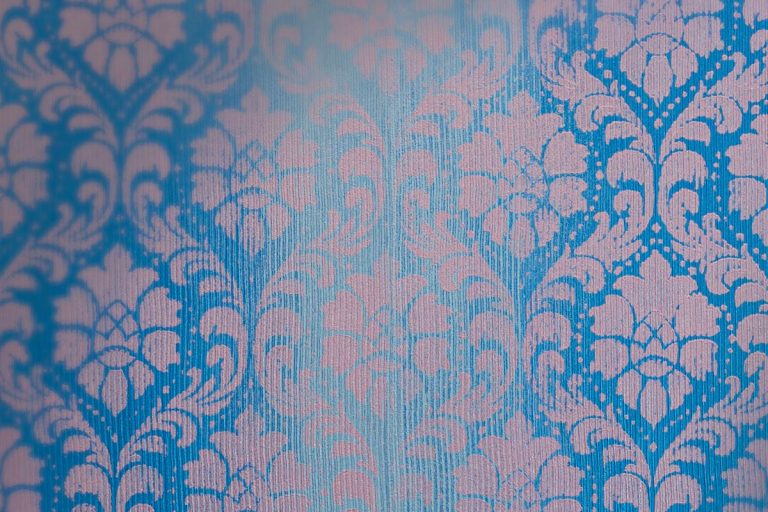
Marble, a noble stone of many shades and colours, deserves a separate mention. In this case, since marble has a typically motley surface and is treated with a glossy finish to enhance its preciousness, it will be better not to overdo with excessively contrasting or glittering wall finishes, preferring more refined finishes such as the very elegant decorative effects of CHIAROSCURI or CLEVSIN..
An exception is black and white marble flooring, which recalls Renaissance or Baroque splendour or Art Deco atmospheres, and looks very good, both with gilded or bronze finishes and with effects and bordure, as proposed by the PETRA APUANA collection with FREGIO D’ARTE, which pick up on some marble tones such as Verona Red or Alpine Green or Calacatta.
IF THE FLOORS ARE IN RESIN OR CEMENT
They are much loved because they match perfectly with modern and contemporary furnishing styles, with the “loft” style and all industrial styles, loved because they create a continuous texture on the floor, without the typical vanishing lines of tiles, they can be neutral or coloured in a variety of shades that will influence our choice of wall colours; we can stay “tone on tone” with the floor (advisable in medium-small rooms) or play with contrasts (more suitable if the rooms are very large as contrasts help us to better define the various areas): then we will counterpose a resin bright floor with dark or solid tones on the walls and vice versa we will give more light to a room with a dark floor with light and bright walls.
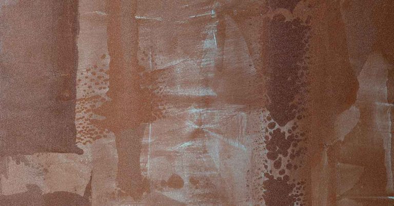
It is also important to consider the finish given to the resin: the glossy floor looks better with walls with a matt finish; vice versa, if the resin is matt or satin we will be able to afford iridescent, spatulate or multi-effect walls to liven up the whole. Some effects that render better are the industrial, scratched or three-dimensional ones, for example, that recall the rust and oxide patinas of metals such as the VELATHRI effect of the TERRE ETRUSCHE collection
Enjoy your floors like never before; and make the most of them by choosing the best wall colours with Viero Decoratives!